Brittany Evans
With over 7 years of experience in graphic design and illustration, I have honed my skills both as a freelancer and within an agency setting. I've collaborated with a diverse array of clients, including non-profits and authors, which has enriched my portfolio and creative perspective. My expertise spans both digital marketing assets and print materials, showcasing my versatility and commitment to delivering exceptional designs that captivate and engage audiences.
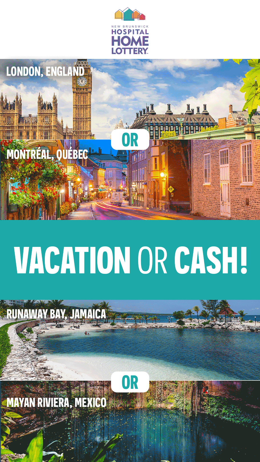
New Brunswick Hospital Home Lottery – Vacation Prize Campaign (Animated GIF)
Designed square and vertical animated GIF assets for social media (Facebook, Instagram, and Snapchat) to promote vacation prizes during a seasonal lottery campaign. The goal was to capture attention in-feed, clearly highlight the prize offering, and drive lottery ticket purchases. I focused on bold typography, motion hierarchy, and brand-aligned visuals to ensure the key message and call-to-action were instantly clear across platforms. The assets were optimized for mobile-first viewing and fast loading while maintaining visual impact and brand consistency.
Tools Used: Photoshop
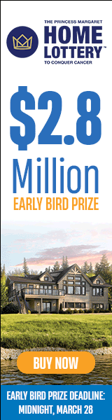
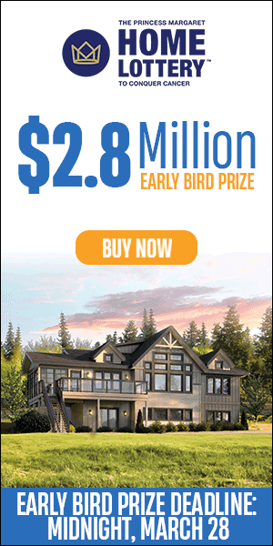
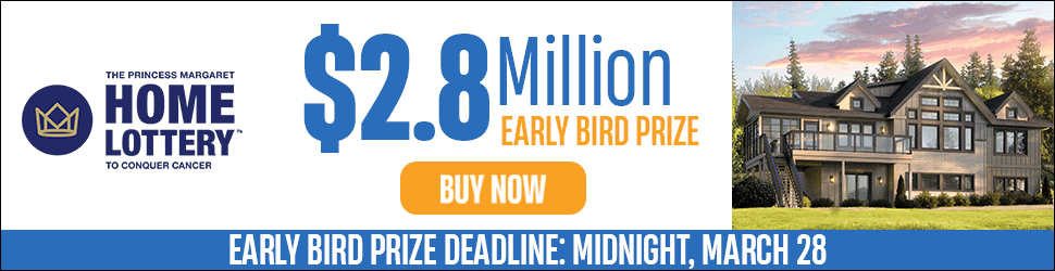
Princess Margaret Home Lottery – Early Bird Cottage Prize (Animated GIF)
Created animated GIFs to promote the early bird cottage prize during a seasonal lottery campaign. Assets were resized into multiple dimensions for Google Display ads to ensure consistent visual impact across various placements. The goal was to drive ticket sales by clearly showcasing the prize and creating a sense of urgency. I focused on bold, eye-catching typography, smooth animation, and brand-aligned design to capture attention quickly and communicate the key message effectively across all ad sizes
Tools Used: Photoshop, Canva


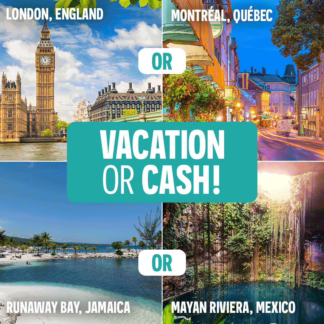
Princess Margaret Cottage Lottery (Static Graphics)
Designed square, horizontal, and vertical assets for social media (Facebook, Instagram, and Snapchat, Reddit) to promote vacation prizes during a seasonal lottery campaign. The goal was to capture attention in-feed, clearly highlight the prize offering, and drive lottery ticket purchases. I focused on bold typography, motion hierarchy, and brand-aligned visuals to ensure the key message and call-to-action were instantly clear across platforms. The assets were optimized for mobile-first viewing and fast loading while maintaining visual impact and brand consistency.
Tools Used: Photoshop
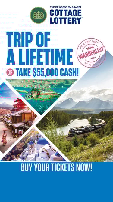
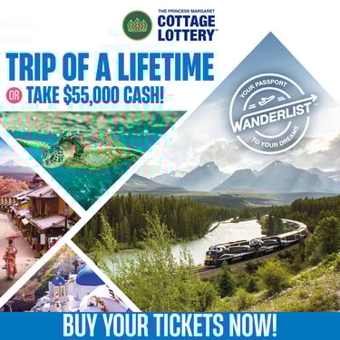
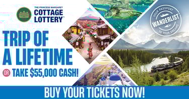
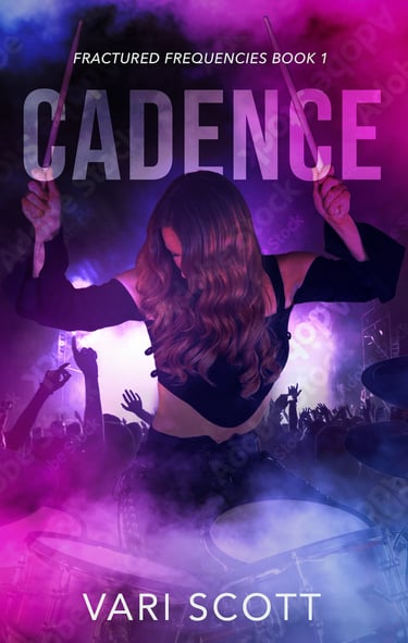
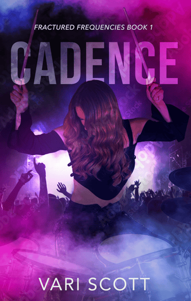
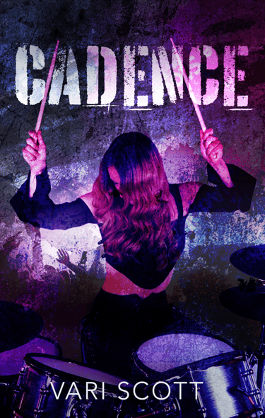
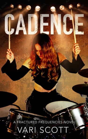
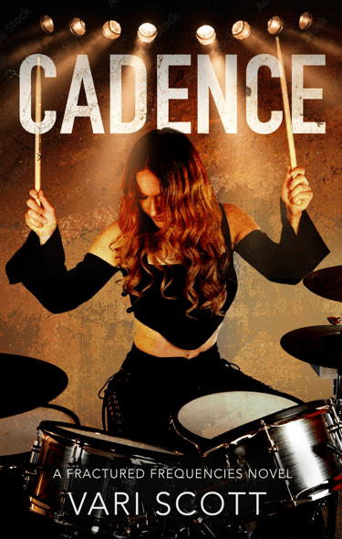
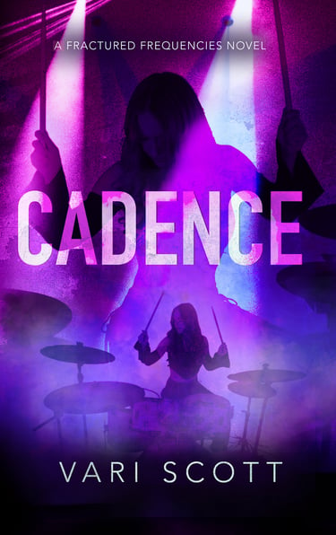
Photo-Manipulation Book Cover - Rockstar Romance (Client Iteration Process)
Created a photo-manipulated book cover for a rockstar romance novel, working from a detailed client brief that specified a licensed drummer image, a purple color palette, and grunge-inspired textures. The initial concept leaned into bold purple tones and a clean rock aesthetic, but after client feedback that it didn’t feel gritty enough, I introduced heavier textures and distressed overlays to amplify the grunge feel.
In the next revision, the client felt the grunge treatment was too intense and requested a shift to orange as the primary color. While the orange version explored a warmer, high-energy direction, the client ultimately preferred purple but struggled to articulate why earlier versions didn’t feel right.
To resolve this, I proposed a new visual hierarchy: reducing the prominence of the main drummer image, reimagining it as a shadowed backdrop, and introducing a smaller focal drummer illuminated by stage spotlights. This approach enhanced depth, mood, and narrative tension, aligning more closely with the book’s tone. The client loved this direction, and it became the final approved concept.
This project highlights my ability to interpret creative briefs, adapt to evolving feedback, and use composition, color, and visual hierarchy to strengthen storytelling and client satisfaction.
Tools Used: Photoshop, InDesign


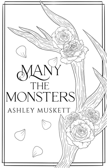
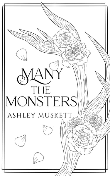
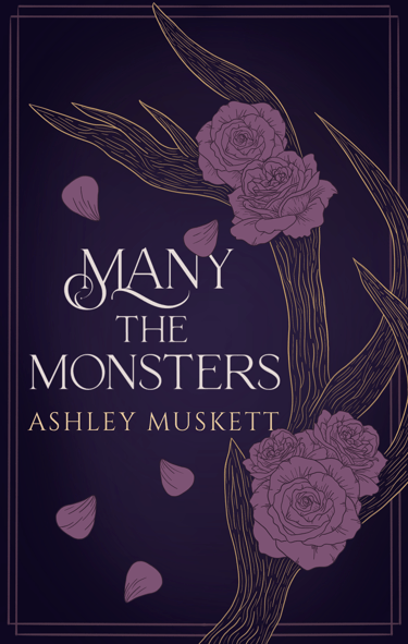
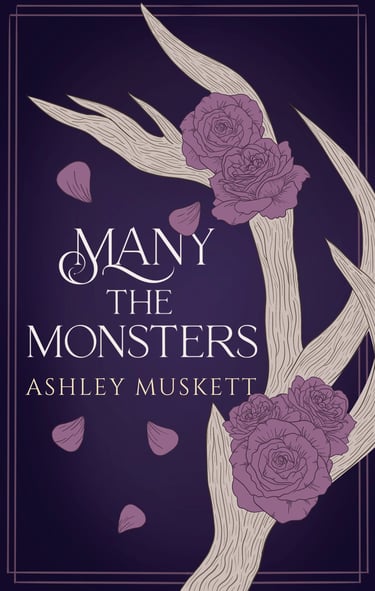
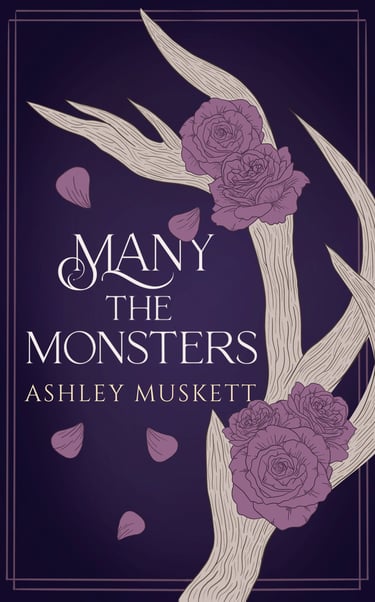
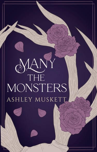
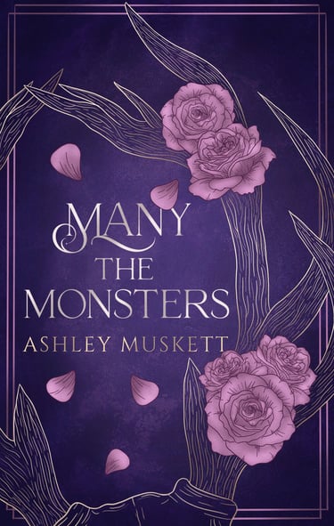
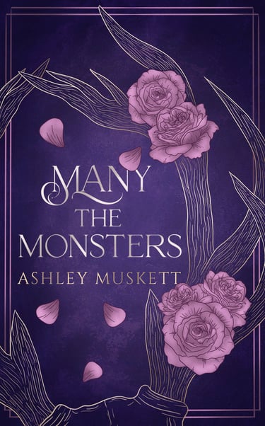
Illustrated Book Cover - Romantasy (Concept Development & Iteration)
Designed an illustrated book cover for a romantasy novel inspired by Beauty and the Beast, featuring antlers and roses as key symbolic elements. The client shared a loose creative brief and referenced the aesthetic of The Raven Scholar by Antonia Hodgson, leaving significant room for interpretation and visual storytelling.
I developed an initial concept focused on a close-up antler entwined with roses, which the client approved without revisions at the sketch stage. During the coloring phase, we explored a purple background, pink roses, and gold line-art antlers. While visually striking, we both realized the antler silhouette wasn’t reading clearly as antlers, which impacted the concept’s clarity.
To improve readability, I tested filling the antlers with a cream tone, but we ultimately felt the form still lacked clarity. I then proposed expanding the composition to include the top of a head and a second antler, strengthening the visual cue and narrative context. This revision successfully clarified the imagery, and the client loved the direction. For the final version, we returned to the gold outline antlers and added refined shading and highlights to unify the illustration and enhance depth while maintaining the elegant, minimal aesthetic.
This project demonstrates my ability to translate abstract inspiration into a cohesive visual concept, iterate collaboratively, and balance readability, storytelling, and stylistic cohesion in illustrated cover design.
Tools Used: Procreate, Illustrator